
Picking the right LED lighting for any space goes way beyond just brightness. It’s about crafting the perfect atmosphere, and for facility managers, an LED color chart is an essential tool for getting it right. But it’s important to understand what these charts actually show. They don’t display colors like red or green; instead, they map out the different shades of white light.
This distinction is crucial when you’re planning an energy conservation project or a lighting upgrade. Getting the color temperature wrong can kill productivity, compromise safety, or turn customers away, negating any cost savings.
Decoding the LED Color Chart for Your Facility
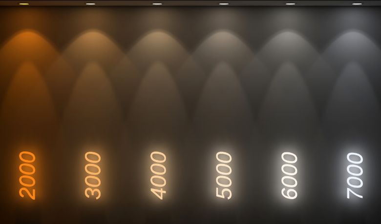
The whole system is based on the Kelvin scale, which was developed by Lord Kelvin back in 1848 to standardize the appearance of light. While the full scale is massive, the LEDs used in most businesses fall somewhere between 2000K and 6000K.
For example, a crisp 4000K bright white light can boost alertness and productivity in a warehouse. On the other hand, a 2700K soft white creates a warm, welcoming feel similar to old incandescent bulbs, but with energy savings of up to 75%. It’s a fascinating field with a long history; you can learn more about how lighting technology has evolved at tcpi.com.
Key Metrics for Business Lighting
To make smart, cost-effective decisions, you need to get a handle on two key metrics. They work together to define the quality of light in any commercial setting. Getting this wrong can lead to poor lighting conditions and completely negate any energy savings from an upgrade.
- Correlated Color Temperature (CCT): This is the one measured in Kelvin (K). It tells you if the white light will look warm (yellowish), neutral, or cool (bluish). Remember: lower Kelvin numbers mean warmer light, and higher numbers mean cooler light.
- Color Rendering Index (CRI): This is a simple scale from 0 to 100 that tells you how accurately a light source shows the true colors of objects. For reference, natural daylight has a perfect CRI of 100. For almost any business application, you should be looking for a CRI of 80 or higher to ensure safety, accuracy, and visual comfort.
A classic mistake is just picking a high Kelvin temperature for every area, thinking “brighter is better.” But a 5000K “daylight” bulb that’s perfect for a detailed workshop can feel sterile and harsh in an office or lobby, which can actually hurt employee focus and the customer experience.
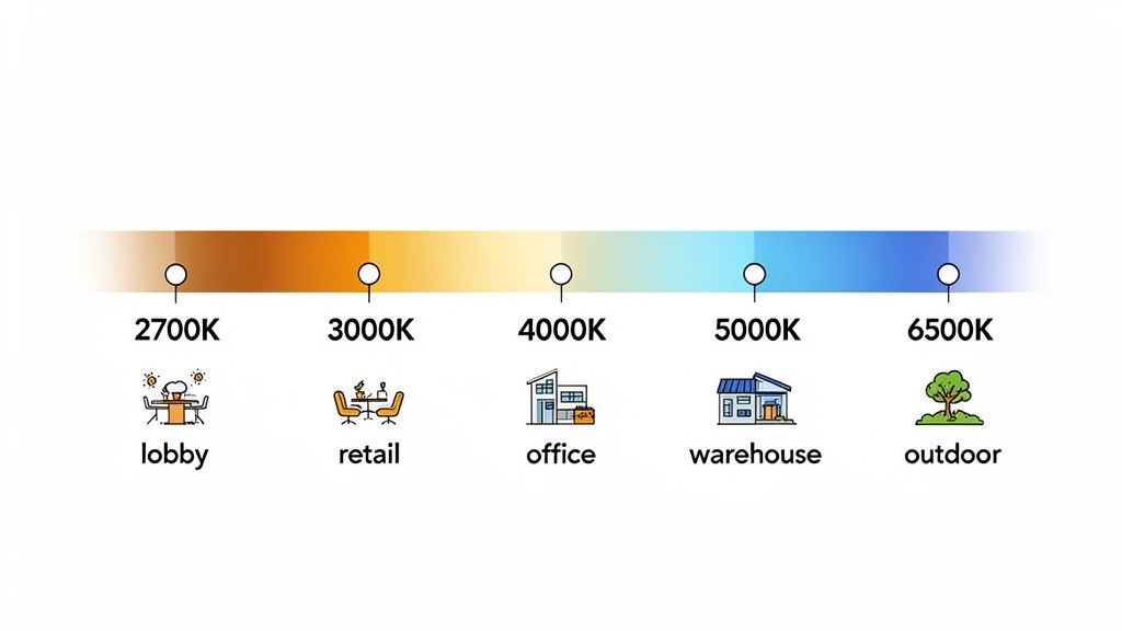
Quick-Reference LED Kelvin Chart for Commercial Applications
To make things easier, we’ve put together a quick-reference chart. This table maps Kelvin values to their common names, visual descriptions, and ideal commercial uses. It’s designed to help facility managers and business owners make fast, informed decisions to optimize their facilities and cut energy costs.
| Kelvin Range (CCT) | Common Name | Visual Description & Atmosphere | Recommended Commercial Applications |
|---|---|---|---|
| 2000K – 2700K | Ultra Warm White / Soft White | Resembles candlelight or incandescent bulbs; creates a cozy, intimate, and relaxing ambiance. | Restaurants (fine dining), hotel lobbies, lounges, high-end residential common areas. |
| 3000K – 3500K | Warm White | A balanced, inviting yellow-white glow that is friendly and professional without being harsh. | Hospitality spaces, office break rooms, general retail stores, reception areas. |
| 4000K – 4500K | Neutral White / Cool White | Crisp, clean, and vibrant white light that promotes focus and alertness. Looks modern and efficient. | General office spaces, warehouses, classrooms, hospitals, commercial kitchens, garages. |
| 5000K – 5700K | Daylight | A very bright, blue-white light that mimics natural daylight. Excellent for tasks requiring high detail. | Workshops, manufacturing facilities, art studios, showrooms, security and outdoor lighting. |
| 6000K – 6500K | Cool Daylight / Bright White | Intense, bluish-white light that is highly stimulating. Can feel clinical if used improperly. | Industrial applications, large commercial sites, task-specific workbenches, grow lights. |
Think of this chart as your starting point. The best choice always depends on the specific function of the space and the operational goals. Blending different CCTs across a facility is often the most effective energy conservation strategy.
Getting a Handle on Correlated Color Temperature (CCT)
Beyond just the numbers on a spec sheet, Correlated Color Temperature (CCT) is probably the single most important factor for shaping the look and feel of a commercial space. If you want to really understand an LED color chart, you have to start with CCT. It’s a measurement on the Kelvin (K) scale that tells you the color appearance of white light, ranging from a warm yellow to a cool blue.
A good way to think about it is like heating a piece of metal. As it gets hotter, it starts to glow—first a deep, warm orange, then a bright, crisp white, and finally a brilliant blue-white at its hottest. The Kelvin scale is a lot like that: lower numbers (under 3300K) mean “warm” light that feels cozy and inviting. Higher numbers (over 5300K) give off a “cool” light that looks bright and energizing. This choice directly impacts how people feel and work in your facility.
How CCT Affects Business Operations
Picking the right CCT isn’t just about aesthetics; it’s a strategic decision that can influence productivity, safety, and even sales. The psychological and physiological effects of light are well-documented, making CCT a powerful tool for any facility manager looking to cut costs and improve operations. A simple lighting retrofit can completely change how effective a space is.
Get the CCT wrong, and a space can feel dated, unwelcoming, or even unsafe. But when you get it right, the right temperature can sharpen focus, improve moods, and make your products look their absolute best.
It’s critical to choose CCT based on what a space is for. An industrial facility where safety and detail-oriented work are the top priorities has completely different lighting needs than a hotel lobby trying to create a luxurious, relaxing vibe for its guests.
Putting It Into Practice: Warm vs. Cool Lighting
Once you understand the difference between warm and cool CCTs, you can dial in the environment to meet specific business goals. Each end of the spectrum has its own advantages depending on the job at hand.
- Warm Light (Under 3300K): This range gives off a calm, welcoming glow that’s perfect for hospitality settings like restaurants and hotel lobbies. It encourages people to relax and can make larger spaces feel more intimate.
- Cool Light (Over 5300K): This is your bright, daylight-mimicking light, ideal for industrial and high-task areas. It boosts alertness and visual acuity, which is essential for safety and precision in warehouses or on manufacturing floors. Choosing the right high bay fixtures with a 5000K CCT can make a real difference in operational safety and reduce energy overhead.
For places like a general office or a school, a neutral CCT around 4000K often hits the sweet spot, promoting alertness without feeling cold or sterile. Retrofitting with efficient T8 LED tubes at this temperature is a great way to boost employee concentration and cut energy costs at the same time. At the end of the day, mastering the LED color chart is all about using CCT to align your lighting with your operational goals.
Understanding the Color Rendering Index (CRI)
While Correlated Color Temperature (CCT) tells you about the color of the light itself, there’s another crucial piece to the puzzle: how that light shows the true colors of objects. This is where the Color Rendering Index (CRI) comes in. Think of it as a simple 0 to 100 scorecard that measures how accurately a light source can reveal colors compared to natural daylight, which gets a perfect 100.
Overlooking CRI is one of the most common—and expensive—mistakes facility managers make during lighting retrofits. A light source with a low CRI can make vibrant colors look dull, washed out, or even change their shade completely. This kind of color distortion can torpedo everything from product appeal in a retail store to critical diagnostic checks in a healthcare setting.
Why CRI Matters for Your Business
In a commercial space, getting colors right isn’t just about aesthetics; it’s a core operational need. A higher CRI means that the colors of your products, safety signs, and even the work environment itself look exactly the way they’re supposed to. For some industries, this isn’t just a nice-to-have, it’s non-negotiable for safety and quality control.
For instance, a CRI below 80 can make fresh produce in a grocery store look old and unappetizing or completely misrepresent the true shade of paint in an auto body shop. On the flip side, a high CRI light source ensures what you see is what you get, which is fundamental for quality control and customer satisfaction.
Interpreting the CRI Scale for Commercial Applications
For almost any business application, you should consider a CRI of 80 or higher as your baseline. Dipping below that number often leads to poor visual comfort and inaccurate color perception. However, many specialized jobs demand an even greater level of color fidelity.
Here’s a practical breakdown:
- Good CRI (80-89): This range is perfectly fine for many general commercial areas where pinpoint color accuracy isn’t the top priority. Think warehouses, parking garages, and some office spaces. It provides clear, solid color quality for most day-to-day work.
- Excellent CRI (90+): When seeing subtle color differences is critical, this is your target. Specifying lighting with a CRI of 90 or above is standard practice for retail displays, art galleries, printing shops, and medical examination rooms. The investment here ensures that products, artwork, and patient diagnostics are all seen in the most accurate light possible.
When you’re planning a facility-wide upgrade, don’t fall into the trap of thinking one CRI rating fits all. A warehouse might run perfectly fine with 80 CRI lighting, but the quality control lab right next to it will absolutely need 90+ CRI to spot subtle product flaws. Tailoring the CRI to each space is the smart way to optimize both performance and budget.
Ultimately, striking the right balance between CCT and CRI is the key to a successful lighting project. When you get the combination right, you’re not just saving energy—you’re actively improving the visual performance, safety, and overall success of your commercial space.
The Complete LED Kelvin Chart and Applications
Choosing the right color temperature is a big deal. It’s a strategic decision that directly impacts employee productivity, operational efficiency, and even safety. To make this process easier, we’ve put together this comprehensive LED Kelvin chart that breaks down the most common CCT values you’ll find in commercial and industrial settings.
Think of this guide as your go-to tool for specifying the perfect lighting for any part of your building, from a welcoming lobby to a high-detail production floor. Each entry below explains the Kelvin value, what it’s commonly called, what it looks like, and where we’ve seen it work best.
2700K Soft White
A 2700K light gives off a very warm, inviting glow that’s almost identical to old-school incandescent bulbs. This color creates a relaxed, comfortable, and almost intimate atmosphere. Because it’s so cozy, it’s generally not the best choice for task-oriented environments where you need people to be alert.
- Best For: Creating a high-end, welcoming ambiance in hospitality settings.
- Common Applications: Fine dining restaurants, hotel lobbies, lounges, and decorative fixtures in executive suites.
3000K Warm White
Slightly cooler and crisper than 2700K, 3000K offers a balanced warm white light that feels friendly yet professional. It’s a super versatile choice that provides a welcoming vibe without looking too yellow or dim. This makes it a popular go-to for a huge range of commercial spaces. It’s an excellent middle-ground CCT for areas that serve both customers and employees.
- Best For: General lighting in public-facing spaces and common areas.
- Common Applications: Reception areas, office break rooms, general retail stores, and hospitality corridors.
4000K Neutral White
This is often the default choice for modern commercial interiors, and for good reason. 4000K delivers a clean, neutral white light that’s known to promote focus and productivity. It renders colors accurately and creates a bright, alert environment without the harsh, clinical feel you can get from higher Kelvin temperatures. This CCT is a real workhorse for countless business applications.
- Best For: Task-oriented spaces where concentration and clarity are essential.
- Common Applications: General offices, classrooms, hospitals, commercial kitchens, and light industrial workshops. If you need more specific guidance, our guide to LED recessed lighting can help you pick the right fixtures for an office upgrade.
5000K Daylight
Just like its name suggests, 5000K CCT mimics natural daylight. It provides a very bright, slightly blue-toned white light that is excellent for enhancing visibility and fine detail. This intense brightness is ideal for large-scale facilities and specific task areas where maximum visual accuracy and safety are the top priorities.
- Best For: High-visibility industrial and task-intensive environments.
- Common Applications: Warehouses, manufacturing plants, automotive shops, large parking lots, and security lighting.
6500K Cool Daylight
Sitting at the highest end of the common commercial spectrum, 6500K produces an intensely bright, bluish-white light. Its stimulating effect can definitely come across as harsh or sterile if it’s used in the wrong place, but it’s incredibly effective for specialized applications that demand the highest possible levels of illumination.
- Best For: Specialized industrial work and detailed inspection areas.
- Common Applications: Laboratories, detailed inspection stations, and certain agricultural grow operations.
How to Read LED Lighting Labels for Your Business
Making a smart call on a large-scale lighting retrofit starts with knowing what’s on the box. While an LED color chart gives you a great visual starting point, the label on the product itself holds the hard data you need to guarantee performance, efficiency, and compliance. For any business, being able to decode these labels is fundamental to maximizing energy savings and getting the job done right.
Most reputable commercial LED products will have a standard label, often called a “Lighting Facts” or ENERGY STAR label. This label is designed to break down the most critical performance stats into a simple, easy-to-read format, giving you much more to go on than just the Kelvin value.
Key Metrics on a Lighting Label
When you’re looking at a new fixture for your facility, these are the core specs to focus on. They all work together to paint a full picture of how the light will perform and what it will cost you to run.
- Lumens (lm): This number tells you the total amount of visible light a bulb puts out—in other words, its brightness. Forget watts; lumens are the modern standard for measuring light output.
- Correlated Color Temperature (CCT): Just like we covered in our LED color chart, this is measured in Kelvin (K) and describes the visual appearance of the light, from a warm yellow to a cool blue.
- Color Rendering Index (CRI): This is a scale from 0-100 that measures how accurately a light source reveals the true colors of objects. For nearly all business applications, a CRI of 80 or higher is what you should be looking for.
- Wattage (W): This tells you how much energy the bulb actually uses. Lower wattage means lower energy bills, plain and simple.
By comparing the lumens to the wattage, you can quickly figure out a bulb’s efficacy—that is, how efficiently it turns electricity into light. A fixture with high lumens and low wattage is always going to give you the best energy savings and return on your investment.
A common mistake is getting fixated on just one metric, like a high lumen count. But a super bright light with a poor CRI can make your products look off-color, while a high CCT might create the completely wrong atmosphere. You’ve got to look at the whole package to maximize your ROI.
Understanding Operational and Safety Ratings
Beyond the primary performance numbers, lighting labels also provide crucial information about where a fixture can be safely installed. These ratings are non-negotiable, especially in commercial and industrial environments where conditions can vary wildly. Getting this right is key to compliance and long-term reliability.
Two of the most important ratings you’ll see are “damp-rated” and “wet-rated.” They’re both critical for areas with any kind of moisture, but they are definitely not interchangeable.
- Damp-Rated: These fixtures can handle moisture and condensation but are not built for direct contact with water. Think restrooms, locker rooms, or covered outdoor patios.
- Wet-Rated: These are built tough enough to endure direct rain, snow, or water spray. You’ll need these for any unsheltered outdoor areas, landscape lighting, or industrial zones that get washed down.
Choosing the wrong rating can lead to early failure, electrical hazards, and a voided warranty. To get the full story, you can learn the difference between damp-rated and wet-rated LED bulbs and make sure your facility is both safe and up to code.
Choosing the Right LED Color for Your Facility
Figuring out how to turn the technical specs from an LED color chart into smart, real-world decisions is where an energy efficiency project really comes to life. Picking the best lighting for your building isn’t a one-size-fits-all deal; it means matching the Correlated Color Temperature (CCT) and Color Rendering Index (CRI) to the specific jobs and feel of each space. Get this right, and your lighting upgrade won’t just save you money—it’ll boost productivity and safety, too.
Don’t mistake this for just a cosmetic choice; it’s an operational one. The wrong lighting can cause eye strain, kill focus, and even create safety hazards, completely undermining the whole point of an LED retrofit.
Modern Offices and Administrative Areas
For any office, the goal is to create a space that keeps people alert and focused without feeling cold or clinical. A clean, neutral white light has become the industry standard for striking this perfect balance.
- Recommended CCT: 4000K is the sweet spot for modern offices. It delivers crisp, clean light that helps cut down on eye fatigue from screen-heavy work and keeps the atmosphere productive all day long.
- Product Focus: Energy-efficient LED flat panels and troffers are perfect for replacing old fluorescent fixtures. They give you even, consistent light and rack up serious energy savings.
Once you have a handle on the technical side of LED color, applying it to real situations is the next step; you can find some brilliant office lighting ideas to improve focus and comfort in any workspace.
Warehouses and Distribution Centers
In big industrial spaces like warehouses, good visibility is directly linked to safety and efficiency. The main objective is to wipe out shadows and make sure that inventory, labels, and potential dangers are all perfectly clear.
This calls for bright, high-clarity lighting that feels a lot like natural daylight. A cool, stimulating light helps keep workers sharp during long shifts and lowers the chance of accidents.
- Recommended CCT: 5000K is the go-to choice for these environments. Its daylight quality provides maximum visual sharpness for tasks like picking, packing, and running machinery.
- Product Focus: High-lumen LED high bay fixtures are built specifically to light up large vertical areas, making sure everything is bright from the floor all the way up to the ceiling.
Healthcare and Educational Facilities
Schools and medical centers have very specific lighting needs where both comfort and clarity are top priorities. The light has to support learning and healing by creating an environment that feels clean, professional, and calming.
In these places, high color rendering is just as crucial as the color temperature itself. Being able to see colors accurately is vital for everything from medical diagnoses to art classes, which makes a high CRI (90+) an absolute must.
Here’s how the requirements break down:
- Classrooms and General Patient Areas: A 4000K CCT creates a bright, focused environment that’s great for learning and general patient care.
- Examination and Procedure Rooms: For accurate visual assessments, a higher 5000K CCT paired with a 90+ CRI is often required.
- Lobbies and Waiting Areas: A slightly warmer 3500K can make lobbies and waiting rooms feel more welcoming and less clinical for students and patients.
Choosing the right lighting has a direct impact on achieving better outcomes in these sensitive spaces. For a more detailed look at getting the most out of your upgrade, you can learn more about finding the best energy-saving LED bulbs for any commercial job.
Common Questions About Commercial LED Lighting
When you’re looking at an LED color chart, a few practical questions always seem to pop up for facility managers and business owners. Getting these details right is the key to a lighting upgrade that’s both successful and cost-effective. Here are some straightforward answers to the questions we hear most often.
Is a Higher Kelvin CCT Better for All Commercial Spaces?
Not at all. While those really high Kelvin values (5000K and up) produce a bright, intense light that feels like daylight, they’re only ideal for specific jobs like warehouse picking or detailed inspections. In other settings, that same light can feel sterile and harsh. The “best” CCT is always about what the space is used for.
For most offices and schools, a neutral white (3500K-4100K) is a much better fit, as it helps with alertness but doesn’t cause eye strain. And if you’re trying to create a welcoming atmosphere in a hotel lobby or restaurant, a warm white (2700K-3000K) is definitely the way to go.
How Does LED Color Temperature Affect Energy Consumption?
Here’s the thing: Correlated Color Temperature (CCT) doesn’t directly impact how much energy a light fixture uses. A 10-watt LED bulb is going to pull 10 watts, regardless of whether it’s a warm 2700K or a cool 5000K. The real energy savings come from the simple fact that LED technology is vastly more efficient than the old lighting it’s replacing.
That said, CCT can have an indirect effect. Our eyes often perceive cooler, higher-Kelvin light as being brighter than warmer light, even at the exact same lumen output. This little psychological trick means you might be able to use fixtures with a slightly lower lumen rating to get the brightness you want, which in turn would reduce your total wattage and lower your energy bill.
Which Is More Important CCT or CRI?
This is a classic question, but the truth is neither one is “more important.” It’s like asking if an engine is more important than the wheels on a car—you need both, and their relevance depends entirely on where you’re going. They measure two completely different, but equally critical, aspects of light quality.
CCT tells you about the color of the light itself (is it warm or cool?), while CRI measures the light’s ability to show the true colors of objects it illuminates.
Think about a massive parking garage. A high CCT is essential for clear visibility and safety, making CRI less of a priority. But in a retail store or a doctor’s office, a high CRI of 90+ is absolutely non-negotiable for showing colors accurately. The CCT is then chosen to match the brand or create a certain mood. For most commercial projects, the goal is to find the right balance of both.
At Conservation Mart, LLC, we’ve got the expertise and the products your business needs to make smart, energy-saving decisions about your lighting. You can explore our full range of commercial LED solutions and find the perfect fit for your facility’s unique needs.